Beacon Street Penthouse 2: A Front Cover Project with a Fiery Past
Boston Home Magazine is featuring our very own Beacon Street Penthouse 2 on the front cover of its ‘Kitchens’ issue. But this home was not always the bright, airy entertaining space it is today. In fact, when we started this project, it was a fire-ravaged shell. The building was hit by lightning in a summer storm, and the resulting fire burned out the top unit completely. Designer Nicole Fichera remembers going on site to take measurements in the dark, smoky space, and shares some of her photography from that visit.
I was still an intern when I first visited this building. We had all heard the story of this project in staff meetings: the building was hit by lightning, and it caused a huge fire that burned out the top floor and caused major water damage on most of the floors below. We had to document the space, so I got my tape measure and my camera and headed over, looking forward to a beautiful summer day out of the office.
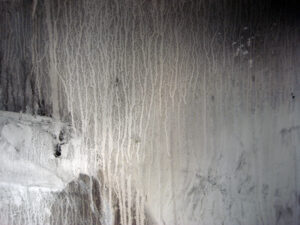
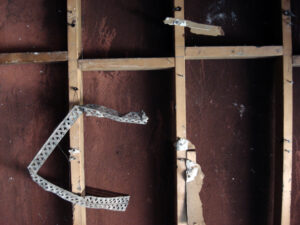
You’ve seen spaces devastated by fire on TV and in movies, but I was not prepared for how it felt in real life. The air was heavy with soot and dust, and the windows were either blocked by smoke and grime or boarded up. Everywhere, lazy swirling ash filtered down through the shallow cracks of light. The drywall was mostly gone, burned off, but what remained was bubbled and blistered, and stained with amazing patterns of smoke and water. It was just empty space and twisted metal, charred two-by-four studs and floorboards thick with ashes.
The kitchen had been on a raised platform in the middle of the main living space. As I looked at it, I realized that the gas pipe for the stove came right up through the middle [maybe to an island]. I traced it upwards visually, and was shocked by how vividly I could imagine the explosion: the ceiling joists above the stove were totally destroyed, charred and eaten away by what must have been the hottest part of the fire.
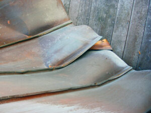
Up on the roof, you could see the story unfold: the lightning hit the copper sheathing on the roof and violently ripped it open. As the fire spread, it heated up all the metal on the roof, giving it this brightly colored heat-induced patina. As I stood feeling the rooftop sun beating down on me, I could just imagine seeing the copper changing color through the wavy heat, and the windows shattering in their shifting metal frames.
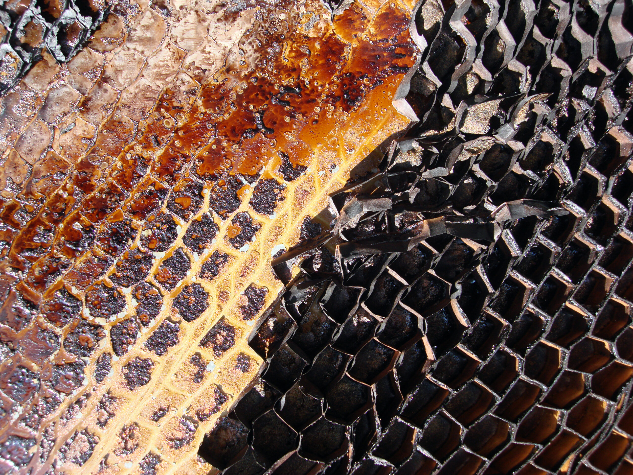
The best part about the roof was the door. There was a steel door that led from the roof deck down into the staircase in the headhouse. The fire and lightning had somehow ripped the layers of the door apart: the steel panel on the front was violently peeled downwards, and the honeycomb structure of the inner door was blackened and twisted into a rich, colorful, dense pattern of razor sharp deformed cells. I took picture after picture–I could hardly tear myself away.
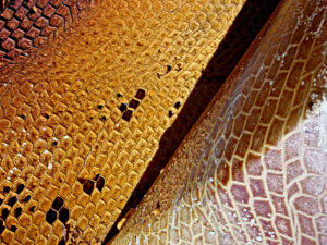
What’s amazing about seeing these photos paired with the photos of the finished space is how seamlessly they coordinate. The client’s elegant collection of copper pots with the mangled copper sheathing; the burnt and streaky walls with the black-and-white plaster panel in the living room; the burnt honeycomb of the door with the deep textures and rusty tones of the antique furniture and artwork. It’s uncanny how the photos are both serene and full of grit, both clean and textured.